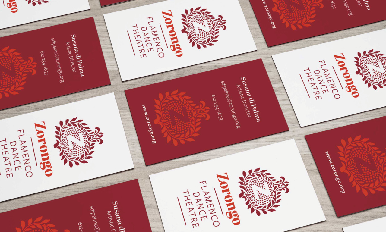
Branding
After 35 years of creating original theater productions and teaching traditional flamenco, Zorongo’s branding was no longer living up to their reputation for artistic excellence.
Discussions with the Artistic Director, Managing Director and board members revealed clear objectives:
1) Increase revenue from performance bookings
2) Develop new audiences and supporters
3) Be recognized as a premier flamenco incubator
Together, we re-examined their mission statement, identified their distinguishing characteristics, and crafted a single-sentence take-away that everyone could get behind. And we defined what success would look like: Zorongo’s new branding needed to reflect the richness of flamenco culture within a trend-aware, consumer-oriented aesthetic.
At the core of the new branding is an elemental color palette reminiscent of blood, wine and earth paired with a suite of Andalusian patterns. These brand elements can play it straight for clear, modern communication, or they can combine and recombine, dialing up the drama and expressing the rhythm and ruckus of a flamenco tablao.
In addition to the flat graphics and stunning performance photography, we identified a vibrant two-color image treatment that could infuse photos — professional or amateur — with the brand’s essential passion.
adam@adamdemers.com • 612-327-1990 • LinkedIn • resumé • ©2019 Adam Demers


